CI/BI
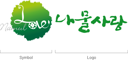
Look closely at the Namul Sarang’s symbol. In LOVE, you can find 2021, the foundation year of the company.
LOVE also signifies Namul Sarang, based on the shapes of lotus root and bracken. We chose green as the color to represent the raw materials we gather from the mountains and fields.

The symbol represents a road, as in hitting the road for the ‘namul’ trip, and the strokes are made to look like sprouting greens.
The organic shapes of the icon are inspired by the natural elements of the mountains, fields, water, and wind leading to the road trip.

In the typography of our brand name, the cooked greens in a bowl were added, as well as the symbol of the spring in the Chinese character, conveying our identity as a provider of spring vegetables to our customers.